Design guide
Our logo is extremely important for the recognition of the Meguin brand and is a key element of our visual image. However, a uniform font and defined colors are also part of our brand identity.
In order to continue to take account of the increased worldwide attention and our success, the use of our design elements must be consistent. We have therefore defined guidelines for the correct use of these.
Designation of origin and claim: Oils of Germany
In the event that a slogan/claim is to be used, “Oils of Germany” may be used. Other slogans or designations of origin are not permitted.
Logo
The central design element is our logo. It consists of the colors red and white. It has a white outline that provides the necessary contrast on non-white backgrounds.
In general, the full-color version is preferable to the black and white version. The shape and colors are fixed and may not be changed. Our trademark may be placed on all colors from the color spectrum, as well as on all photos.
Our current logo is registered internationally under trademark law.
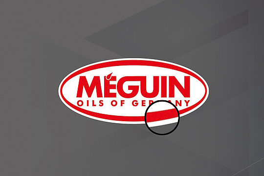
White outline
If the background is not white, the logo must have a white outline.

Two-color variant (black and white)
These variants are only used for black and white printing.
Colors
Our company colors are derived from our logo. The red and white logo is Meguin's trademark and defines the main colors Meguin red and white for all print and web applications.
Meguin red
Application: Logo, surfaces
CMYK: 0/100/100/0
RGB: 226/0/26
HEX: #e2001a
RAL: 3020, traffic red
Pantone: 185 C
HKS: 13
White
Application: Logo, surfaces
CMYK: 0/0/0/0
RGB: 255/255/255
HEX: #ffffff
RAL: 9010
Black
Application: Text, surfaces
CMYK: 0/0/0/100
RGB: 0/0/0
HEX: #000000
RAL: 8022
Pantone: Black C
HKS: 88
Typography
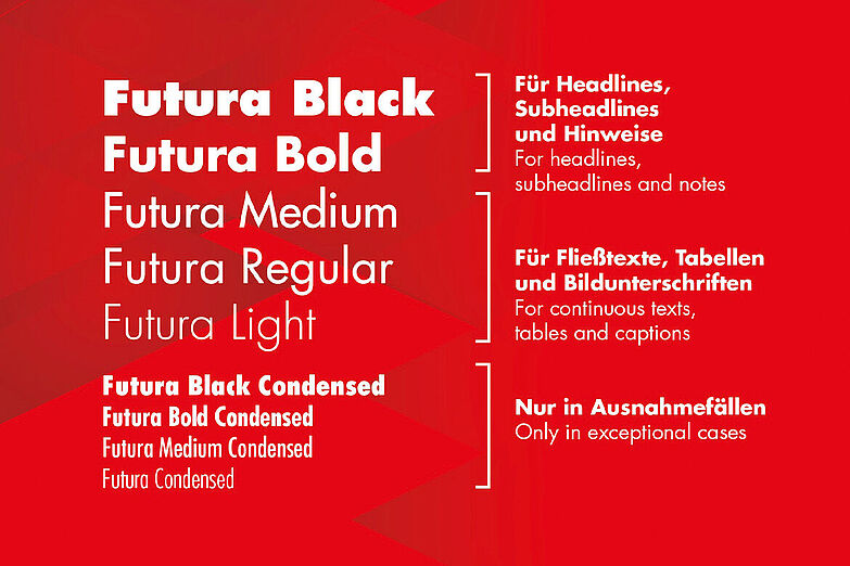
Our corporate typeface is Futura Next. Its typographic orientation is both striking and straightforward and serious. With its various weights (regular, medium, bold, etc.), our corporate typeface supports the diverse character of our brand.
Spellings
The correct spelling of our brand is “Meguin”. Other spellings such as Méguin, MEGUIN or MÉGUIN are incorrect and may not be used.
In addition to the stringent visual appearance, spelling is an important component in conveying homogeneity, authenticity and professionalism in communication. A consistent language style shapes the identity and image of our company, whether on advertising materials and websites or in letters and emails. Make sure your correspondence is as clear, understandable and friendly as possible.
This overview provides you with building blocks, rules and tools for dealing with our corporate style of writing.
| Spelling of company name | Meguin |
| Address coordinates | The following spelling rules according to DIN 5008 are decisive for the standardized spelling of our address elements:
|
| Address block spelling (National) | LIQUI MOLY Produktions GmbH & Co. KG Rodener Straße 25 66740 Saarlouis Telefon: 06831 8909-0 Fax: 06831 8909-59 E-Mail: info.meguin@liqui-moly.de www.meguin.com |
| Address block spelling (International) | LIQUI MOLY Produktions GmbH & Co. KG Rodener Straße 25 66740 Saarlouis GERMANY Phone: +49 6831 8909-0 Fax: +49 6831 8909-59 E-Mail: info.meguin@liqui-moly.de www.meguin.com |
| Word combinations with company names | Words following our company name are always hyphenated.
|
| Compound words | Always write words or word combinations together if possible. Avoid hyphenated words so as not to interrupt the flow of the text. Exceptions should only be made if legibility or comprehensibility would no longer be guaranteed or if a part of a word is to be deliberately emphasized. Examples:
|
| Product names | The spelling of our product names is always based on the product name in our system. Examples:
Note: It is essential to always use the product name in full. |
